Flap
Deprecated since version 1.4: See the migration guide
Superclasses: Widget, InitiallyUnowned, Object
Implemented Interfaces: Swipeable, Accessible, Buildable, ConstraintTarget, Orientable
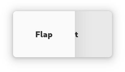
An adaptive container acting like a box or an overlay.
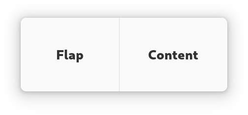
The AdwFlap widget can display its children like a Box does or
like a Overlay does, according to the
fold_policy value.
AdwFlap has at most three children: content,
flap and separator. Content is the primary
child, flap is displayed next to it when unfolded, or overlays it when
folded. Flap can be shown or hidden by changing the
reveal_flap value, as well as via swipe gestures if
swipe_to_open and/or swipe_to_close are set
to TRUE.
Optionally, a separator can be provided, which would be displayed between the content and the flap when there’s no shadow to separate them, depending on the transition type.
flap is transparent by default; add the
`.background <style-classes.html#background>`_ style class to it if this is
unwanted.
If modal is set to TRUE, content becomes completely
inaccessible when the flap is revealed while folded.
The position of the flap and separator children relative to the content is
determined by orientation, as well as the flap_position
value.
Folding the flap will automatically hide the flap widget, and unfolding it
will automatically reveal it. If this behavior is not desired, the
locked property can be used to override it.
Common use cases include sidebars, header bars that need to be able to overlap the window content (for example, in fullscreen mode) and bottom sheets.
AdwFlap as GtkBuildable
The AdwFlap implementation of the Buildable interface supports
setting the flap child by specifying “flap” as the “type” attribute of a
<child> element, and separator by specifying “separator”. Specifying
“content” child type or omitting it results in setting the content child.
CSS nodes
AdwFlap has a single CSS node with name flap. The node will get the style
classes .folded when it is folded, and .unfolded when it’s not.
Constructors
Methods
- class Flap
-
- get_fold_duration() int
Gets the fold transition animation duration for
self, in milliseconds.Deprecated since version 1.4:
- get_fold_policy() FlapFoldPolicy
Gets the fold policy for
self.Deprecated since version 1.4:
- get_fold_threshold_policy() FoldThresholdPolicy
Gets the fold threshold policy for
self.Deprecated since version 1.4:
- get_folded() bool
Gets whether
selfis currently folded.See
fold_policy.Deprecated since version 1.4:
- get_reveal_flap() bool
Gets whether the flap widget is revealed for
self.Deprecated since version 1.4:
- get_reveal_params() SpringParams
Gets the reveal animation spring parameters for
self.Deprecated since version 1.4:
- get_reveal_progress() float
Gets the current reveal progress for
self.0 means fully hidden, 1 means fully revealed.
See
reveal_flap.Deprecated since version 1.4:
- get_swipe_to_close() bool
Gets whether
selfcan be closed with a swipe gesture.Deprecated since version 1.4:
- get_swipe_to_open() bool
Gets whether
selfcan be opened with a swipe gesture.Deprecated since version 1.4:
- get_transition_type() FlapTransitionType
Gets the type of animation used for reveal and fold transitions in
self.Deprecated since version 1.4:
- set_content(content: Widget | None = None) None
Sets the content widget for
self.It’s always displayed when unfolded, and partially visible when folded.
Deprecated since version 1.4:
- Parameters:
content – the content widget
- set_flap(flap: Widget | None = None) None
Sets the flap widget for
self.It’s only visible when
reveal_progressis greater than 0.Deprecated since version 1.4:
- Parameters:
flap – the flap widget
- set_flap_position(position: PackType) None
Sets the flap position for
self.If it’s set to
GTK_PACK_START, the flap is displayed before the content, ifGTK_PACK_END, it’s displayed after the content.Deprecated since version 1.4:
- Parameters:
position – the new value
- set_fold_duration(duration: int) None
Sets the fold transition animation duration for
self, in milliseconds.Deprecated since version 1.4:
- Parameters:
duration – the new duration, in milliseconds
- set_fold_policy(policy: FlapFoldPolicy) None
Sets the fold policy for
self.Deprecated since version 1.4:
- Parameters:
policy – the fold policy
- set_fold_threshold_policy(policy: FoldThresholdPolicy) None
Sets the fold threshold policy for
self.If set to
ADW_FOLD_THRESHOLD_POLICY_MINIMUM, flap will only fold when the children cannot fit anymore. WithADW_FOLD_THRESHOLD_POLICY_NATURAL, it will fold as soon as children don’t get their natural size.This can be useful if you have a long ellipsizing label and want to let it ellipsize instead of immediately folding.
Deprecated since version 1.4:
- Parameters:
policy – the policy to use
- set_locked(locked: bool) None
Sets whether
selfis locked.If
FALSE, folding when the flap is revealed automatically closes it, and unfolding it when the flap is not revealed opens it. IfTRUE,reveal_flapvalue never changes on its own.Deprecated since version 1.4:
- Parameters:
locked – the new value
- set_modal(modal: bool) None
Sets whether
selfis modal.If
TRUE, clicking the content widget while flap is revealed, as well as pressing the Esc key, will close the flap. IfFALSE, clicks are passed through to the content widget.Deprecated since version 1.4:
- Parameters:
modal – whether
selfis modal
- set_reveal_flap(reveal_flap: bool) None
Sets whether the flap widget is revealed for
self.Deprecated since version 1.4:
- Parameters:
reveal_flap – whether to reveal the flap widget
- set_reveal_params(params: SpringParams) None
Sets the reveal animation spring parameters for
self.The default value is equivalent to:
adw_spring_params_new (1, 0.5, 500)
Deprecated since version 1.4:
- Parameters:
params – the new parameters
- set_separator(separator: Widget | None = None) None
Sets the separator widget for
self.It’s displayed between content and flap when there’s no shadow to display. When exactly it’s visible depends on the
transition_typevalue.Deprecated since version 1.4:
- Parameters:
separator – the separator widget
- set_swipe_to_close(swipe_to_close: bool) None
Sets whether
selfcan be closed with a swipe gesture.The area that can be swiped depends on the
transition_typevalue.Deprecated since version 1.4:
- Parameters:
swipe_to_close – whether
selfcan be closed with a swipe gesture
- set_swipe_to_open(swipe_to_open: bool) None
Sets whether
selfcan be opened with a swipe gesture.The area that can be swiped depends on the
transition_typevalue.Deprecated since version 1.4:
- Parameters:
swipe_to_open – whether
selfcan be opened with a swipe gesture
- set_transition_type(transition_type: FlapTransitionType) None
Sets the type of animation used for reveal and fold transitions in
self.flapis transparent by default, which means the content will be seen through it withADW_FLAP_TRANSITION_TYPE_OVERtransitions; add the`.background<style-classes.html#background>`_ style class to it if this is unwanted.Deprecated since version 1.4:
- Parameters:
transition_type – the new transition type
Properties
- class Flap
- props.content: Widget
The content widget.
It’s always displayed when unfolded, and partially visible when folded.
Deprecated since version 1.4:
- props.flap: Widget
The flap widget.
It’s only visible when
reveal_progressis greater than 0.Deprecated since version 1.4:
- props.flap_position: PackType
The flap position.
If it’s set to
GTK_PACK_START, the flap is displayed before the content, ifGTK_PACK_END, it’s displayed after the content.Deprecated since version 1.4:
- props.fold_duration: int
The fold transition animation duration, in milliseconds.
Deprecated since version 1.4:
- props.fold_policy: FlapFoldPolicy
The fold policy for the flap.
Deprecated since version 1.4:
- props.fold_threshold_policy: FoldThresholdPolicy
Determines when the flap will fold.
If set to
ADW_FOLD_THRESHOLD_POLICY_MINIMUM, flap will only fold when the children cannot fit anymore. WithADW_FOLD_THRESHOLD_POLICY_NATURAL, it will fold as soon as children don’t get their natural size.This can be useful if you have a long ellipsizing label and want to let it ellipsize instead of immediately folding.
Deprecated since version 1.4:
- props.folded: bool
Whether the flap is currently folded.
See
fold_policy.Deprecated since version 1.4:
- props.locked: bool
Whether the flap is locked.
If
FALSE, folding when the flap is revealed automatically closes it, and unfolding it when the flap is not revealed opens it. IfTRUE,reveal_flapvalue never changes on its own.Deprecated since version 1.4:
- props.modal: bool
Whether the flap is modal.
If
TRUE, clicking the content widget while flap is revealed, as well as pressing the Esc key, will close the flap. IfFALSE, clicks are passed through to the content widget.Deprecated since version 1.4:
- props.reveal_params: SpringParams
The reveal animation spring parameters.
The default value is equivalent to:
adw_spring_params_new (1, 0.5, 500)
Deprecated since version 1.4:
- props.reveal_progress: float
The current reveal transition progress.
0 means fully hidden, 1 means fully revealed.
See
reveal_flap.Deprecated since version 1.4:
- props.separator: Widget
The separator widget.
It’s displayed between content and flap when there’s no shadow to display. When exactly it’s visible depends on the
transition_typevalue.Deprecated since version 1.4:
- props.swipe_to_close: bool
Whether the flap can be closed with a swipe gesture.
The area that can be swiped depends on the
transition_typevalue.Deprecated since version 1.4:
- props.swipe_to_open: bool
Whether the flap can be opened with a swipe gesture.
The area that can be swiped depends on the
transition_typevalue.Deprecated since version 1.4:
- props.transition_type: FlapTransitionType
the type of animation used for reveal and fold transitions.
flapis transparent by default, which means the content will be seen through it withADW_FLAP_TRANSITION_TYPE_OVERtransitions; add the`.background<style-classes.html#background>`_ style class to it if this is unwanted.Deprecated since version 1.4: