Dialog
Added in version 1.5.
Superclasses: Widget, InitiallyUnowned, Object
Subclasses: AboutDialog, AlertDialog, PreferencesDialog
Implemented Interfaces: Accessible, Buildable, ConstraintTarget
An adaptive dialog container.
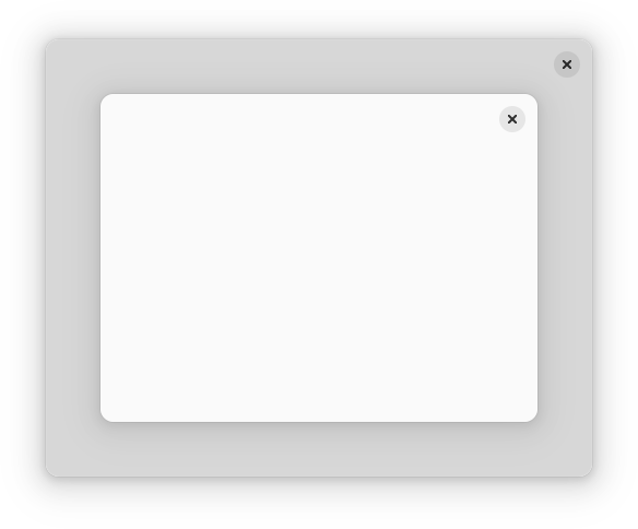
AdwDialog is similar to a window, but is shown within another window. It
can be used with Window and ApplicationWindow, use
present to show it.
AdwDialog is not resizable. Use the content_width and
content_height properties to set its size, or set
follows_content_size to TRUE to make the dialog track the
content’s size as it changes. AdwDialog can never be larger than its parent
window.
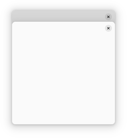
AdwDialog can be presented as a centered floating window or a bottom sheet.
By default it’s automatic depending on the available size.
presentation_mode can be used to change that.
AdwDialog can be closed via close.
When presented as a bottom sheet, AdwDialog can also be closed via swiping
it down.
The can_close can be used to prevent closing. In that case,
close_attempt gets emitted instead.
Use force_close to close the dialog even when can-close is set to
FALSE.
Header Bar Integration
When placed inside an AdwDialog, HeaderBar will display the dialog
title instead of window title. It will also adjust the decoration layout to
ensure it always has a close button and nothing else. Set
show_start_title_buttons and
show_end_title_buttons to FALSE to remove it if it’s
unwanted.
Breakpoints
AdwDialog can be used with Breakpoint the same way as
BreakpointBin. Refer to that widget’s documentation for details.
Like AdwBreakpointBin, if breakpoints are used, AdwDialog doesn’t have a
minimum size, and width_request and
height_request properties must be set manually.
Constructors
Methods
- class Dialog
- add_breakpoint(breakpoint: Breakpoint) None
Adds
breakpointtoself.Added in version 1.5.
- Parameters:
breakpoint – the breakpoint to add
- close() bool
Attempts to close
self.If the
can_closeproperty is set toFALSE, theclose_attemptsignal is emitted.See also:
force_close.Added in version 1.5.
- force_close() None
Closes
self.Unlike
close, it succeeds even ifcan_closeis set toFALSE.Added in version 1.5.
- get_current_breakpoint() Breakpoint | None
Gets the current breakpoint.
Added in version 1.5.
- get_follows_content_size() bool
Gets whether to size content of
selfautomatically.Added in version 1.5.
- get_presentation_mode() DialogPresentationMode
Gets presentation mode for
self.Added in version 1.5.
- present(parent: Widget | None = None) None
Presents
selfwithinparent’s window.If
selfis already shown, raises it to the top instead.If the window is an
WindoworApplicationWindow, the dialog will be shown within it. Otherwise, it will be a separate window.Added in version 1.5.
- Parameters:
parent – a widget within the toplevel
- set_can_close(can_close: bool) None
Sets whether
selfcan be closed.If set to
FALSE, the close button, shortcuts andclosewill result inclose_attemptbeing emitted instead, and bottom sheet close swipe will be disabled.force_closestill works.Added in version 1.5.
- Parameters:
can_close – whether to allow closing
- set_child(child: Widget | None = None) None
Sets the child widget of
self.Added in version 1.5.
- Parameters:
child – the child widget
- set_content_height(content_height: int) None
Sets the height of the dialog’s contents.
Set it to -1 to reset it to the content’s natural height.
See also:
default_heightAdded in version 1.5.
- Parameters:
content_height – the content height
- set_content_width(content_width: int) None
Sets the width of the dialog’s contents.
Set it to -1 to reset it to the content’s natural width.
See also:
default_widthAdded in version 1.5.
- Parameters:
content_width – the content width
- set_default_widget(default_widget: Widget | None = None) None
Sets the default widget for
self.It’s activated when the user presses Enter.
Added in version 1.5.
- Parameters:
default_widget – the default widget
- set_focus(focus: Widget | None = None) None
Sets the focus widget for
self.If
focusis not the current focus widget, and is focusable, sets it as the focus widget for the dialog.If focus is
NULL, unsets the focus widget for this dialog. To set the focus to a particular widget in the dialog, it is usually more convenient to usegrab_focusinstead of this function.Added in version 1.5.
- Parameters:
focus – the focus widget
- set_follows_content_size(follows_content_size: bool) None
Sets whether to size content of
selfautomatically.If set to
TRUE, always use the content’s natural size instead ofcontent_widthandcontent_height. If the content resizes, the dialog will immediately resize as well.See also:
resizableAdded in version 1.5.
- Parameters:
follows_content_size – whether to size content automatically
- set_presentation_mode(presentation_mode: DialogPresentationMode) None
Sets presentation mode for
self.When set to
ADW_DIALOG_AUTO, the dialog appears as a bottom sheet when the following condition is met:max-width: 450px or max-height: 360px, and as a floating window otherwise.Set it to
ADW_DIALOG_FLOATINGorADW_DIALOG_BOTTOM_SHEETto always present it a floating window or a bottom sheet respectively, regardless of available size.Presentation mode does nothing for dialogs presented as a window.
Added in version 1.5.
- Parameters:
presentation_mode – the new presentation mode
Properties
- class Dialog
- props.can_close: bool
Whether the dialog can be closed.
If set to
FALSE, the close button, shortcuts andclosewill result inclose_attemptbeing emitted instead, and bottom sheet close swipe will be disabled.force_closestill works.Added in version 1.5.
- props.content_height: int
The height of the dialog’s contents.
Set it to -1 to reset it to the content’s natural height.
See also:
default_heightAdded in version 1.5.
- props.content_width: int
The width of the dialog’s contents.
Set it to -1 to reset it to the content’s natural width.
See also:
default_widthAdded in version 1.5.
- props.current_breakpoint: Breakpoint
The current breakpoint.
Added in version 1.5.
- props.default_widget: Widget
The default widget.
It’s activated when the user presses Enter.
Added in version 1.5.
- props.follows_content_size: bool
Whether to size content automatically.
If set to
TRUE, always use the content’s natural size instead ofcontent_widthandcontent_height. If the content resizes, the dialog will immediately resize as well.See also:
resizableAdded in version 1.5.
- props.presentation_mode: DialogPresentationMode
The dialog’s presentation mode.
When set to
ADW_DIALOG_AUTO, the dialog appears as a bottom sheet when the following condition is met:max-width: 450px or max-height: 360px, and as a floating window otherwise.Set it to
ADW_DIALOG_FLOATINGorADW_DIALOG_BOTTOM_SHEETto always present it a floating window or a bottom sheet respectively, regardless of available size.Presentation mode does nothing for dialogs presented as a window.
Added in version 1.5.
Signals
Virtual Methods
Fields
- class Dialog
- parent_instance