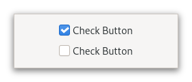
CheckButton
Superclasses: Widget, InitiallyUnowned, Object
Implemented Interfaces: Accessible, Actionable, Buildable, ConstraintTarget
A GtkCheckButton places a label next to an indicator.
A GtkCheckButton is created by calling either new
or new_with_label.
The state of a GtkCheckButton can be set specifically using
set_active, and retrieved using
get_active.
Inconsistent state
In addition to “on” and “off”, check buttons can be an “in between” state that is neither on nor off. This can be used e.g. when the user has selected a range of elements (such as some text or spreadsheet cells) that are affected by a check button, and the current values in that range are inconsistent.
To set a GtkCheckButton to inconsistent state, use
set_inconsistent.
Grouping
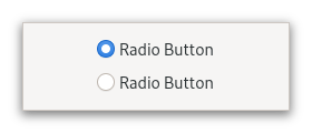
Check buttons can be grouped together, to form mutually exclusive groups - only one of the buttons can be toggled at a time, and toggling another one will switch the currently toggled one off.
Grouped check buttons use a different indicator, and are commonly referred to as radio buttons.
To add a GtkCheckButton to a group, use set_group.
When the code must keep track of the state of a group of radio buttons, it
is recommended to keep track of such state through a stateful
GAction with a target for each button. Using the toggled signals to keep
track of the group changes and state is discouraged.
CSS nodes
checkbutton[.text-button]
├── check
╰── [label]
A GtkCheckButton has a main node with name checkbutton. If the
label or child
properties are set, it contains a child widget. The indicator node
is named check when no group is set, and radio if the checkbutton
is grouped together with other checkbuttons.
Accessibility
GtkCheckButton uses the CHECKBOX role.
Constructors
Methods
- class CheckButton
-
- get_child() Widget | None
Gets the child widget of
buttonorNULLiflabelis set.Added in version 4.8.
- set_active(setting: bool) None
Changes the check buttons active state.
- Parameters:
setting – the new value to set
- set_child(child: Widget | None = None) None
Sets the child widget of
button.Note that by using this API, you take full responsibility for setting up the proper accessibility label and description information for
button. Most likely, you’ll either set the accessibility label or description forbuttonexplicitly, or you’ll set a labelled-by or described-by relations fromchildtobutton.Added in version 4.8.
- Parameters:
child – the child widget
- set_group(group: CheckButton | None = None) None
Adds
selfto the group ofgroup.In a group of multiple check buttons, only one button can be active at a time. The behavior of a checkbutton in a group is also commonly known as a radio button.
Setting the group of a check button also changes the css name of the indicator widget’s CSS node to ‘radio’.
Setting up groups in a cycle leads to undefined behavior.
Note that the same effect can be achieved via the
ActionableAPI, by using the same action with parameter type and state type ‘s’ for all buttons in the group, and giving each button its own target value.- Parameters:
group – another
GtkCheckButtonto form a group with
- set_inconsistent(inconsistent: bool) None
Sets the
GtkCheckButtonto inconsistent state.You should turn off the inconsistent state again if the user checks the check button. This has to be done manually.
- Parameters:
inconsistent –
Trueif state is inconsistent
- set_label(label: str | None = None) None
Sets the text of
self.If
use_underlineisTrue, an underscore inlabelis interpreted as mnemonic indicator, seeset_use_underlinefor details on this behavior.- Parameters:
label – The text shown next to the indicator, or
Noneto show no text
- set_use_underline(setting: bool) None
Sets whether underlines in the label indicate mnemonics.
If
settingisTrue, an underscore character inself’s label indicates a mnemonic accelerator key. This behavior is similar touse_underline.- Parameters:
setting – the new value to set
Properties
- class CheckButton
- props.active: bool
If the check button is active.
Setting
activetoTruewill add the:checked:state to both the check button and the indicator CSS node.
- props.group: CheckButton
The check button whose group this widget belongs to.
Signals
- class CheckButton.signals
- activate() None
Emitted to when the check button is activated.
The
::activatesignal onGtkCheckButtonis an action signal and emitting it causes the button to animate press then release.Applications should never connect to this signal, but use the
toggledsignal.The default bindings for this signal are all forms of the <kbd>␣</kbd> and Enter keys.
Added in version 4.2.
Virtual Methods
Fields
- class CheckButton
- parent_instance