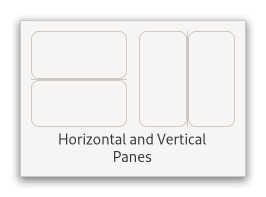
Paned
Superclasses: Widget, InitiallyUnowned, Object
Implemented Interfaces: Accessible, AccessibleRange, Buildable, ConstraintTarget, Orientable
A widget with two panes, arranged either horizontally or vertically.

The division between the two panes is adjustable by the user by dragging a handle.
Child widgets are added to the panes of the widget with
set_start_child and set_end_child.
The division between the two children is set by default from the size
requests of the children, but it can be adjusted by the user.
A paned widget draws a separator between the two child widgets and a
small handle that the user can drag to adjust the division. It does not
draw any relief around the children or around the separator. (The space
in which the separator is called the gutter.) Often, it is useful to put
each child inside a Frame so that the gutter appears as a
ridge. No separator is drawn if one of the children is missing.
Each child has two options that can be set, “resize” and “shrink”. If
“resize” is true then, when the GtkPaned is resized, that child will
expand or shrink along with the paned widget. If “shrink” is true, then
that child can be made smaller than its requisition by the user.
Setting “shrink” to false allows the application to set a minimum size.
If “resize” is false for both children, then this is treated as if
“resize” is true for both children.
The application can set the position of the slider as if it were set
by the user, by calling set_position.
CSS nodes
paned
├── <child>
├── separator[.wide]
╰── <child>
GtkPaned has a main CSS node with name paned, and a subnode for
the separator with name separator. The subnode gets a .wide style
class when the paned is supposed to be wide.
In horizontal orientation, the nodes are arranged based on the text direction, so in left-to-right mode, :first-child will select the leftmost child, while it will select the rightmost child in RTL layouts.
Creating a paned widget with minimum sizes.
GtkWidget *hpaned = gtk_paned_new (GTK_ORIENTATION_HORIZONTAL);
GtkWidget *frame1 = gtk_frame_new (NULL);
GtkWidget *frame2 = gtk_frame_new (NULL);

gtk_widget_set_size_request (hpaned, 200, -1);

gtk_paned_set_start_child (GTK_PANED (hpaned), frame1);
gtk_paned_set_resize_start_child (GTK_PANED (hpaned), TRUE);
gtk_paned_set_shrink_start_child (GTK_PANED (hpaned), FALSE);
gtk_widget_set_size_request (frame1, 50, -1);

gtk_paned_set_end_child (GTK_PANED (hpaned), frame2);
gtk_paned_set_resize_end_child (GTK_PANED (hpaned), FALSE);
gtk_paned_set_shrink_end_child (GTK_PANED (hpaned), FALSE);
gtk_widget_set_size_request (frame2, 50, -1);
Constructors
- class Paned
- classmethod new(orientation: Orientation) Widget
Creates a new
GtkPanedwidget.- Parameters:
orientation – the paned’s orientation.
Methods
- class Paned
-
- get_resize_start_child() bool
Returns whether the
start_childcan be resized.
- get_shrink_start_child() bool
Returns whether the
start_childcan shrink.
- set_end_child(child: Widget | None = None) None
Sets the end child of
panedtochild.If
childisNULL, the existing child will be removed.- Parameters:
child – the widget to add
- set_position(position: int) None
Sets the position of the divider between the two panes.
- Parameters:
position – pixel position of divider, a negative value means that the position is unset
- set_resize_end_child(resize: bool) None
Sets whether the
end_childcan be resized.- Parameters:
resize – true to let the end child be resized
- set_resize_start_child(resize: bool) None
Sets whether the
start_childcan be resized.- Parameters:
resize – true to let the start child be resized
- set_shrink_end_child(resize: bool) None
Sets whether the
end_childcan shrink.- Parameters:
resize – true to let the end child be shrunk
- set_shrink_start_child(resize: bool) None
Sets whether the
start_childcan shrink.- Parameters:
resize – true to let the start child be shrunk
- set_start_child(child: Widget | None = None) None
Sets the start child of
panedtochild.If
childisNULL, the existing child will be removed.- Parameters:
child – the widget to add
- set_wide_handle(wide: bool) None
Sets whether the separator should be wide.
- Parameters:
wide – the new value for the
wide_handleproperty
Properties
- class Paned
-
- props.max_position: int
The largest possible value for the
positionproperty.This property is derived from the size and shrinkability of the widget’s children.
- props.min_position: int
The smallest possible value for the
positionproperty.This property is derived from the size and shrinkability of the widget’s children.
- props.resize_end_child: bool
Determines whether the second child expands and shrinks along with the paned widget.
- props.resize_start_child: bool
Determines whether the first child expands and shrinks along with the paned widget.
- props.shrink_end_child: bool
Determines whether the second child can be made smaller than its requisition.
Signals
- class Paned.signals
- accept_position() bool
Emitted to accept the current position of the handle when moving it using key bindings.
This is a keybinding signal.
The default binding for this signal is Return or Space.
- cancel_position() bool
Emitted to cancel moving the position of the handle using key bindings.
The position of the handle will be reset to the value prior to moving it.
This is a keybinding signal.
The default binding for this signal is Escape.
- cycle_child_focus(reversed: bool) bool
Emitted to cycle the focus between the children of the paned.
This is a keybinding signal.
The default binding is F6.
- Parameters:
reversed – whether cycling backward or forward
- cycle_handle_focus(reversed: bool) bool
Emitted to cycle whether the paned should grab focus to allow the user to change position of the handle by using key bindings.
This is a keybinding signal.
The default binding for this signal is F8.
- Parameters:
reversed – whether cycling backward or forward
- move_handle(scroll_type: ScrollType) bool
Emitted to move the handle with key bindings.
This is a keybinding signal.
- Parameters:
scroll_type – a
GtkScrollType
- toggle_handle_focus() bool
Emitted to accept the current position of the handle and then move focus to the next widget in the focus chain.
This is a keybinding signal.
The default binding is Tab.