Notebook
Superclasses: Widget, InitiallyUnowned, Object
Implemented Interfaces: Accessible, Buildable, ConstraintTarget
GtkNotebook is a container whose children are pages switched
between using tabs.
There are many configuration options for GtkNotebook. Among
other things, you can choose on which edge the tabs appear
(see set_tab_pos), whether, if there are
too many tabs to fit the notebook should be made bigger or scrolling
arrows added (see set_scrollable), and whether
there will be a popup menu allowing the users to switch pages.
(see popup_enable).
GtkNotebook as GtkBuildable
The GtkNotebook implementation of the GtkBuildable interface
supports placing children into tabs by specifying “tab” as the
“type” attribute of a <child> element. Note that the content
of the tab must be created before the tab can be filled.
A tab child can be specified without specifying a <child>
type attribute.
To add a child widget in the notebooks action area, specify
“action-start” or “action-end” as the “type” attribute of the
<child> element.
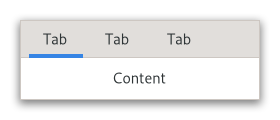
An example of a UI definition fragment with GtkNotebook:
<object class="GtkNotebook">
  <child>
    <object class="GtkLabel" id="notebook-content">
      <property name="label">Content</property>
    </object>
  </child>
  <child type="tab">
    <object class="GtkLabel" id="notebook-tab">
      <property name="label">Tab</property>
    </object>
  </child>
</object>
CSS nodes
notebook
├── header.top
│   ├── [<action widget>]
│   ├── tabs
│   │   ├── [arrow]
│   │   ├── tab
│   │   │   ╰── <tab label>
┊   ┊   ┊
│   │   ├── tab[.reorderable-page]
│   │   │   ╰── <tab label>
│   │   ╰── [arrow]
│   ╰── [<action widget>]
│
╰── stack
    ├── <child>
    ┊
    ╰── <child>
GtkNotebook has a main CSS node with name notebook, a subnode
with name header and below that a subnode with name tabs which
contains one subnode per tab with name tab.
If action widgets are present, their CSS nodes are placed next
to the tabs node. If the notebook is scrollable, CSS nodes with
name arrow are placed as first and last child of the tabs node.
The main node gets the .frame style class when the notebook
has a border (see set_show_border).
The header node gets one of the style class .top, .bottom,
.left or .right, depending on where the tabs are placed. For
reorderable pages, the tab node gets the .reorderable-page class.
A tab node gets the .dnd style class while it is moved with drag-and-drop.
The nodes are always arranged from left-to-right, regardless of text direction.
Accessibility
GtkNotebook uses the following roles:
Constructors
Methods
- class Notebook
- append_page(child: Widget, tab_label: Widget | None = None) int
Appends a page to
notebook.- Parameters:
child – the
GtkWidgetto use as the contents of the pagetab_label – the
GtkWidgetto be used as the label for the page, orNoneto use the default label, “page N”
Appends a page to
notebook, specifying the widget to use as the label in the popup menu.- Parameters:
child – the
GtkWidgetto use as the contents of the pagetab_label – the
GtkWidgetto be used as the label for the page, orNoneto use the default label, “page N”menu_label – the widget to use as a label for the page-switch menu, if that is enabled. If
None, andtab_labelis aGtkLabelorNone, then the menu label will be a newly created label with the same text astab_label; iftab_labelis not aGtkLabel,menu_labelmust be specified if the page-switch menu is to be used.
- detach_tab(child: Widget) None
Removes the child from the notebook.
This function is very similar to
remove_page, but additionally informs the notebook that the removal is happening as part of a tab DND operation, which should not be cancelled.- Parameters:
child – a child
- get_action_widget(pack_type: PackType) Widget | None
Gets one of the action widgets.
See
set_action_widget.- Parameters:
pack_type – pack type of the action widget to receive
Retrieves the menu label widget of the page containing
child.- Parameters:
child – a widget contained in a page of
notebook
Retrieves the text of the menu label for the page containing
child.- Parameters:
child – the child widget of a page of the notebook.
- get_nth_page(page_num: int) Widget | None
Returns the child widget contained in page number
page_num.- Parameters:
page_num – the index of a page in the notebook, or -1 to get the last page
- get_page(child: Widget) NotebookPage
Returns the
GtkNotebookPageforchild.- Parameters:
child – a child of
notebook
- get_pages() ListModel
Returns a
GListModelthat contains the pages of the notebook.This can be used to keep an up-to-date view. The model also implements
SelectionModeland can be used to track and modify the visible page.
- get_tab_detachable(child: Widget) bool
Returns whether the tab contents can be detached from
notebook.- Parameters:
child – a child
GtkWidget
- get_tab_label(child: Widget) Widget | None
Returns the tab label widget for the page
child.Noneis returned ifchildis not innotebookor if no tab label has specifically been set forchild.- Parameters:
child – the page
- get_tab_label_text(child: Widget) str | None
Retrieves the text of the tab label for the page containing
child.- Parameters:
child – a widget contained in a page of
notebook
- get_tab_pos() PositionType
Gets the edge at which the tabs are drawn.
- get_tab_reorderable(child: Widget) bool
Gets whether the tab can be reordered via drag and drop or not.
- Parameters:
child – a child
GtkWidget
- insert_page(child: Widget, tab_label: Widget | None, position: int) int
Insert a page into
notebookat the given position.- Parameters:
child – the
GtkWidgetto use as the contents of the pagetab_label – the
GtkWidgetto be used as the label for the page, orNoneto use the default label, “page N”position – the index (starting at 0) at which to insert the page, or -1 to append the page after all other pages
Insert a page into
notebookat the given position, specifying the widget to use as the label in the popup menu.- Parameters:
child – the
GtkWidgetto use as the contents of the pagetab_label – the
GtkWidgetto be used as the label for the page, orNoneto use the default label, “page N”menu_label – the widget to use as a label for the page-switch menu, if that is enabled. If
None, andtab_labelis aGtkLabelorNone, then the menu label will be a newly created label with the same text astab_label; iftab_labelis not aGtkLabel,menu_labelmust be specified if the page-switch menu is to be used.position – the index (starting at 0) at which to insert the page, or -1 to append the page after all other pages.
- page_num(child: Widget) int
Finds the index of the page which contains the given child widget.
- Parameters:
child – a
GtkWidget
- popup_enable() None
Enables the popup menu.
If the user clicks with the right mouse button on the tab labels, a menu with all the pages will be popped up.
- prepend_page(child: Widget, tab_label: Widget | None = None) int
Prepends a page to
notebook.- Parameters:
child – the
GtkWidgetto use as the contents of the pagetab_label – the
GtkWidgetto be used as the label for the page, orNoneto use the default label, “page N”
Prepends a page to
notebook, specifying the widget to use as the label in the popup menu.- Parameters:
child – the
GtkWidgetto use as the contents of the pagetab_label – the
GtkWidgetto be used as the label for the page, orNoneto use the default label, “page N”menu_label – the widget to use as a label for the page-switch menu, if that is enabled. If
None, andtab_labelis aGtkLabelorNone, then the menu label will be a newly created label with the same text astab_label; iftab_labelis not aGtkLabel,menu_labelmust be specified if the page-switch menu is to be used.
- prev_page() None
Switches to the previous page.
Nothing happens if the current page is the first page.
- remove_page(page_num: int) None
Removes a page from the notebook given its index in the notebook.
- Parameters:
page_num – the index of a notebook page, starting from 0. If -1, the last page will be removed.
- reorder_child(child: Widget, position: int) None
Reorders the page containing
child, so that it appears in positionposition.If
positionis greater than or equal to the number of children in the list or negative,childwill be moved to the end of the list.- Parameters:
child – the child to move
position – the new position, or -1 to move to the end
- set_action_widget(widget: Widget, pack_type: PackType) None
Sets
widgetas one of the action widgets.Depending on the pack type the widget will be placed before or after the tabs. You can use a
GtkBoxif you need to pack more than one widget on the same side.- Parameters:
widget – a
GtkWidgetpack_type – pack type of the action widget
- set_current_page(page_num: int) None
Switches to the page number
page_num.Note that due to historical reasons, GtkNotebook refuses to switch to a page unless the child widget is visible. Therefore, it is recommended to show child widgets before adding them to a notebook.
- Parameters:
page_num – index of the page to switch to, starting from 0. If negative, the last page will be used. If greater than the number of pages in the notebook, nothing will be done.
- set_group_name(group_name: str | None = None) None
Sets a group name for
notebook.Notebooks with the same name will be able to exchange tabs via drag and drop. A notebook with a
Nonegroup name will not be able to exchange tabs with any other notebook.- Parameters:
group_name – the name of the notebook group, or
Noneto unset it
Changes the menu label for the page containing
child.- Parameters:
child – the child widget
menu_label – the menu label, or
Nonefor default
Creates a new label and sets it as the menu label of
child.- Parameters:
child – the child widget
menu_text – the label text
- set_scrollable(scrollable: bool) None
Sets whether the tab label area will have arrows for scrolling if there are too many tabs to fit in the area.
- Parameters:
scrollable –
Trueif scroll arrows should be added
- set_show_border(show_border: bool) None
Sets whether a bevel will be drawn around the notebook pages.
This only has a visual effect when the tabs are not shown.
- Parameters:
show_border –
Trueif a bevel should be drawn around the notebook
- set_show_tabs(show_tabs: bool) None
Sets whether to show the tabs for the notebook or not.
- Parameters:
show_tabs –
Trueif the tabs should be shown
- set_tab_detachable(child: Widget, detachable: bool) None
Sets whether the tab can be detached from
notebookto another notebook or widget.Note that two notebooks must share a common group identifier (see
set_group_name) to allow automatic tabs interchange between them.If you want a widget to interact with a notebook through DnD (i.e.: accept dragged tabs from it) it must be set as a drop destination by adding to it a
DropTargetcontroller that accepts the GTypeGTK_TYPE_NOTEBOOK_PAGE. The:valueof said drop target will be preloaded with aNotebookPageobject that corresponds to the dropped tab, so you can process the value via::acceptor::dropsignals.Note that you should use
detach_tabinstead ofremove_pageif you want to remove the tab from the source notebook as part of accepting a drop. Otherwise, the source notebook will think that the dragged tab was removed from underneath the ongoing drag operation, and will initiate a drag cancel animation.static void on_drag_data_received (GtkWidget *widget, GdkDrop *drop, GtkSelectionData *data, guint time, gpointer user_data) { GtkDrag *drag; GtkWidget *notebook; GtkWidget **child; drag = gtk_drop_get_drag (drop); notebook = g_object_get_data (drag, "gtk-notebook-drag-origin"); child = (void*) gtk_selection_data_get_data (data); // process_widget (*child); gtk_notebook_detach_tab (GTK_NOTEBOOK (notebook), *child); }
If you want a notebook to accept drags from other widgets, you will have to set your own DnD code to do it.
- Parameters:
child – a child
GtkWidgetdetachable – whether the tab is detachable or not
- set_tab_label(child: Widget, tab_label: Widget | None = None) None
Changes the tab label for
child.If
Noneis specified fortab_label, then the page will have the label “page N”.- Parameters:
child – the page
tab_label – the tab label widget to use, or
Nonefor default tab label
- set_tab_label_text(child: Widget, tab_text: str) None
Creates a new label and sets it as the tab label for the page containing
child.- Parameters:
child – the page
tab_text – the label text
- set_tab_pos(pos: PositionType) None
Sets the edge at which the tabs are drawn.
- Parameters:
pos – the edge to draw the tabs at
Properties
- class Notebook
- props.enable_popup: bool
If
True, pressing the right mouse button on the notebook shows a page switching menu.
- props.tab_pos: PositionType
Which side of the notebook holds the tabs.
Signals
- class Notebook.signals
-
- create_window(page: Widget) Notebook | None
The ::create-window signal is emitted when a detachable tab is dropped on the root window.
A handler for this signal can create a window containing a notebook where the tab will be attached. It is also responsible for moving/resizing the window and adding the necessary properties to the notebook (e.g. the
GtkNotebook:group-name ).- Parameters:
page – the tab of
notebookthat is being detached
- focus_tab(object: NotebookTab) bool
- Parameters:
object
- move_focus_out(object: DirectionType) None
- Parameters:
object
- page_added(child: Widget, page_num: int) None
the ::page-added signal is emitted in the notebook right after a page is added to the notebook.
- Parameters:
child – the child
GtkWidgetaffectedpage_num – the new page number for
child
- page_removed(child: Widget, page_num: int) None
the ::page-removed signal is emitted in the notebook right after a page is removed from the notebook.
- Parameters:
child – the child
GtkWidgetaffectedpage_num – the
childpage number
- page_reordered(child: Widget, page_num: int) None
the ::page-reordered signal is emitted in the notebook right after a page has been reordered.
- Parameters:
child – the child
GtkWidgetaffectedpage_num – the new page number for
child
- reorder_tab(object: DirectionType, p0: bool) bool
- Parameters:
object
p0